[ Hello ]
Arteak
Hello Terence,this one is for Arteak.
Good to be back in touch, Terence. It's been a while since we talked about the website, so I've put this page together: a short video from me above, then what we noticed on the site as it is now and what we'd do first.

[ Today ]
Your site at a glance
Your site today,by the numbers.
Speed
Google, on mobile
Accessibility
For every visitor
Speed is how quickly the homepage shows up on a phone, using Google's own test. The first words appear in under three seconds and the opening photograph at about five, which is respectable. Most of the wait is that photograph, and the analytics code that loads alongside it. Accessibility is about whether everyone can use the site, including people with a screen reader. 87 is good. The gaps are small ones: a link and a few images at the bottom of the page with no written label, and a cookie button whose text is faint against its colour.
SEO
Google's checks
AEO
Ready for AI answers
SEO is Google's own checklist for how easy a page is to find, and 85 is good. The main gap is that the homepage has no short description for search results. AEO is our own check of how ready a site is for AI assistants like ChatGPT, which now answer a lot of the questions people used to type into Google. Arteak passes four of our eight checks. Assistants are free to read the site, and the homepage has a clear main heading. What's missing is your details set out for them, descriptions on some of the pictures and some recent dated news.
Page weight
Homepage download
Page weight is everything the homepage downloads on a phone before it's finished loading. At 1.4MB yours is light. The photographs are under half of that and the rest is mostly code and your film, so there's very little to trim.
Built on
Today
WordPress runs a big share of the web and it's a sound choice, with full control over your own pages. What the setup affects is how the site is looked after over time, because it's made of several parts that all need keeping up to date together.
[ Notes ]
What I noticed
A few thingsI noticed on your site.
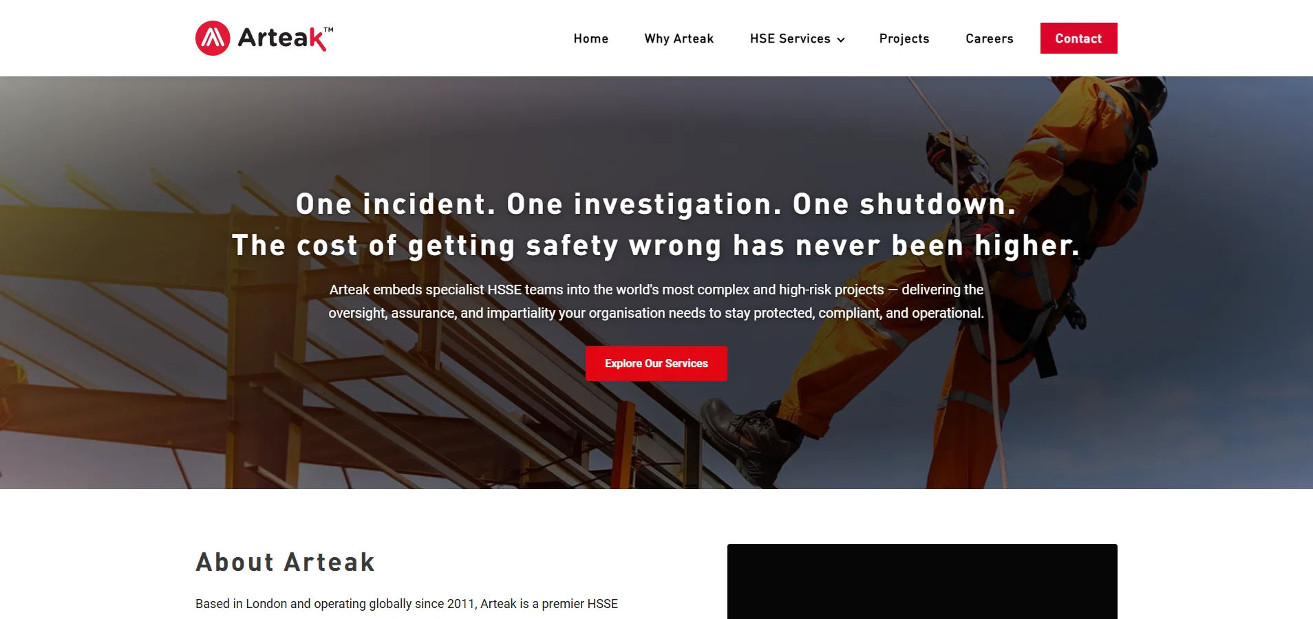
Someone at Arteak has put real thought into the words. "One incident. One investigation. One shutdown." is a great opening line, written for the person who actually signs the contract, and the rest of the homepage talks about what worries a director before it gets to the services. You've also got your own film, your own people in Arteak kit, and the kind of numbers and clients most firms would love to have. And it's clear the site has had work recently. Most of our thoughts are about helping the design catch up with the writing.
A strong logo, with room to grow into a brand
Your logo is strong, and the red carries through the site well. Beyond that, the look leans mostly on that one colour, with the headings set in a couple of different typefaces and spacings, so there isn't yet much that only Arteak could own. A few elements of your own would change that: a typeface chosen to sit with the logo, the chevron in your mark used as a graphic device, and one style of photography with people in Arteak kit. That can be your own team, or library shots with the overalls and hard hats in your red and carrying your logo. Used the same way on every page, that's what creates the right perception before anyone has spoken to you.
The work is hard to find
Your Projects page says a selection of past work is on its way. For now the proof is some big numbers and a few client logos, quite a long way down the homepage. Someone hiring a safety team for a high-risk site wants to see you've done it somewhere like theirs. A few projects told properly would say more than any number.
Your film is cropped and in a plain player
The film on the homepage is the best footage on the site, because it's your own kit and your own people at work. On a desktop it sits in a nearly square box, so a good part of the picture is cut off. It also plays in the browser's standard player, volume slider and all, for a film with no sound. Shown at its proper shape, in a player that looks like yours, it could be the centrepiece of the homepage. It would sit well on the page for that service too.
The opening screen carries too much
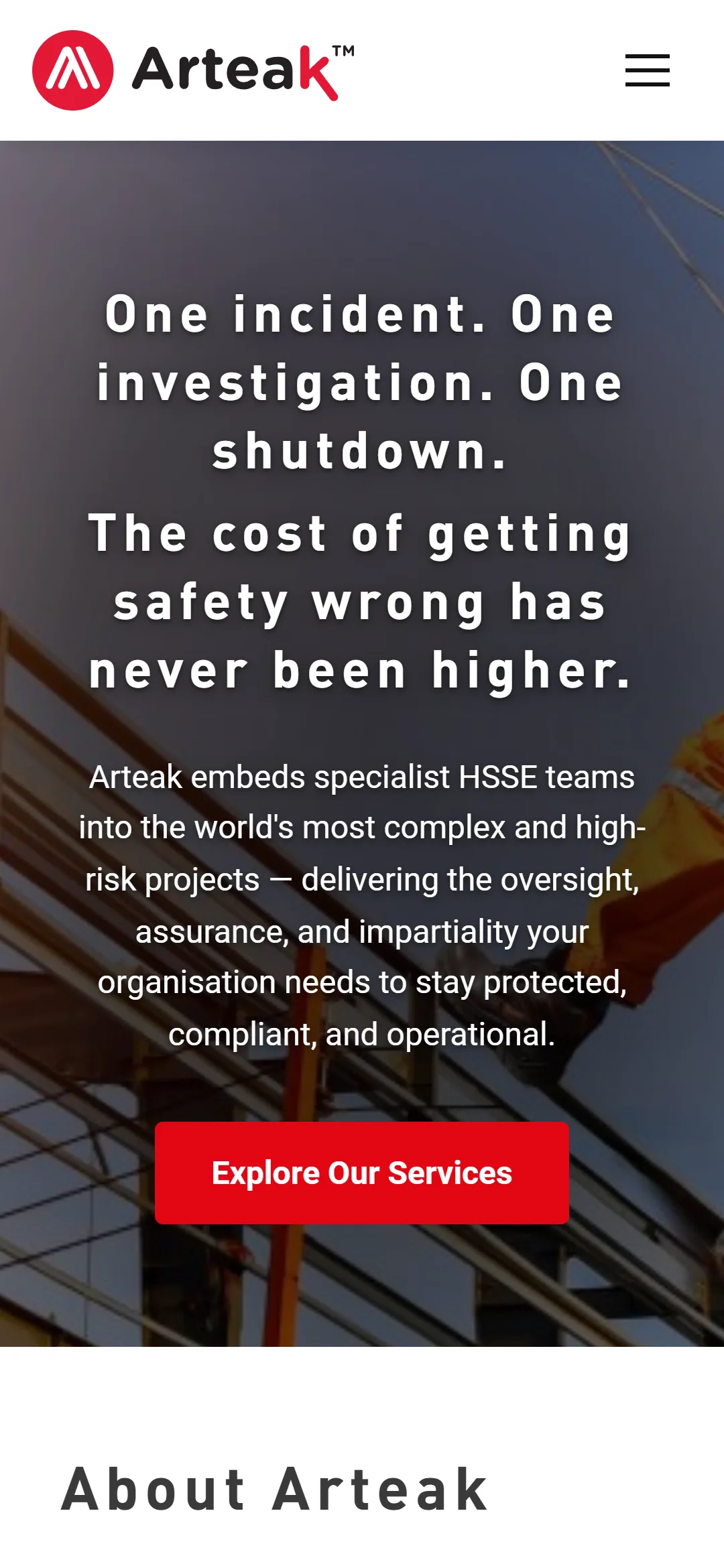
The headline does the selling on its own. Under it there's a long paragraph in white, centred over a busy photograph, so it's hard to read and it pushes the button down the screen. The button then invites a worried director to read more, when they'd probably rather talk to someone. The headline alone over a calmer picture, with an easy way to get in touch, would hit harder.
Everything is centred, and the homepage is long
Nearly every section is centred, in small grey type, so nothing stands out from anything else. Your sharpest thinking, about what worries the people at the top, carries the same weight as sections that say much less. On a phone the homepage is a very long scroll. With the text lined up on the left and a shorter page, someone reading in a hurry would get to the important parts first.
Bringing the older pages along
The newer pages share a clean, tidy layout, and it's clear a lot of care has gone into them. A few of the older pages are still around in the previous design, and one button on the homepage leads to one of them, so a visitor can slip from the new look into the old without meaning to. Bringing everything into the new look would make the whole site feel as considered as your newest pages.
Getting in touch could feel more personal
The Contact button is always in view, which is good. The contact page has a form, a map and your details, but it doesn't say who you'd be writing to or when you'd hear back. A senior person making a big decision likes to know who they'll be speaking to. And on the homepage the phone number is plain text, not a link you can tap.
AI assistants are becoming the first place people ask
More and more people ask ChatGPT, Claude or Google's AI who to hire before they search. Your homepage has a clear main heading, which helps. What's missing is a short description of the business for search results, and your details set out in a way assistants can read. Some recent news would help too. The site has clearly been worked on lately, but the last dated post is from a few years ago.
01
02
03
04
05
06
07
08
A brand built from the logo
A typeface chosen to sit with the logo, the chevron used as a graphic element, and one style of photography, your own people or library shots in your kit and colours, used the same way across every page.
Tell a few projects properly
A Projects page with a few real stories and your own photographs. Where it was, what the risk was, who you placed there and how it went. Then a link to it straight after the opening screen.
Show the film at its best
The film at its full shape, in a player in your red with a proper title. On the homepage, and on the page for the service it shows.
A lighter opening screen
The headline on its own over a calmer picture, with a button that offers a conversation.
Bring the older pages along
Move what's worth keeping from the older pages into the new design, so every way in leads to the new site. Then the text lined up on the left throughout.
A named contact, and a site AI assistants can describe
A name and a photo on the contact page, with a note on how quickly you reply, and a phone number you can tap. Then a short description for search results and your business details set out for AI assistants.
[ Fixes ]
Suggested fixes
What I'd fix first,and why it matters.
01
02
03
04
05
06
07
08
[ Context ]
How your clients read a site
Clients look at the finished work,then at how it's presented.
A client, an architect or a trust choosing a contractor is trusting them with money, programme and their own reputation. They look at the finished work first, then at how carefully it's presented. A site that shows completed projects properly does a lot of the reassuring before the tender meeting.
[ Work ]
Firms in a similar position
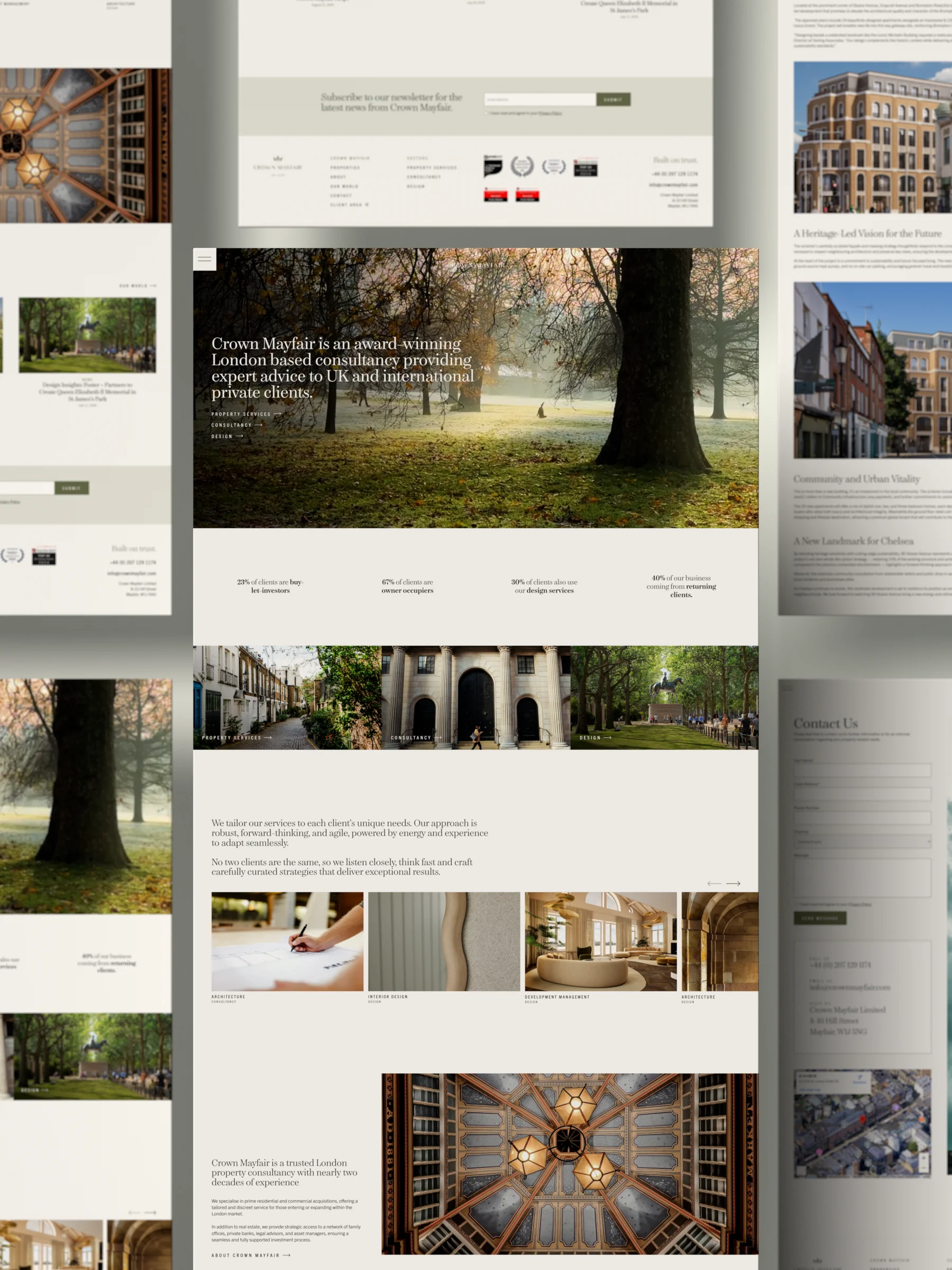
Work for firmsin a similar position.




[ Said about the work ]
“Our new website has increased website leads by over 50% and our engagement rate by 35%, leading to more viewings and sales.”
Joel Rayney
Campaign Manager, SiteSales (now Regenta)
“From our branding to our brand new website and bespoke CGI video, the whole thing was handled by the same people.”
Jack Preston
Founder, Set Connect
“Their attention to detail and eye for design is unbeaten. We won't be going anywhere else.”
Harison Smith
Founder, Tidywork Studio
[ Studio ]
How we work
Who you'd be working with,and what you can hold us to.
01
One person, brief to launch
PIXEL SILO is two people. I design, build and make the imagery myself, and Zoe runs the projects, so you deal with the people doing the work.
02
A fixed scope before design
You get a written scope, a timeline and one fixed price before any design begins, so nothing about the cost or the schedule arrives as a surprise.
03
It keeps up with the business
Most sites are accurate on launch day and slowly stop being true. Adapt is how we keep working on yours: a plan for what it has to prove next, and studio time each month to see it through.
[ Selected clients ]
5 years as a studio



[ Before the studio ]
15 years agency-side


[ Next steps ]
What happens next
What happensif you say yes.
01
20 minutes
A first conversation
No preparation. We talk about the business and what the site has to do, and you get an honest view of whether we're the right fit.
02
3-5 days
Scope and fixed price
A written scope, a timeline and one fixed price, mapped onto wireframes of how the site flows.
03
Roughly six weeks
Design, imagery and build
Two or three directions, one agreed, then every page designed and built, with the imagery made here alongside.
04
Launch
Launch and handover
A walkthrough so your team can run the site. Bug fixes are free for the first month, and Adapt keeps it moving after that.
[ Next ]
A conversation
Worth a conversation?Twenty minutes, nothing to prepare.
No need to reply
if the timing isn't right.