9 stunning websites that use 3D graphics and CGI to grab attention

The growth of 3D graphics
Websites and mobile interfaces are increasingly turning to 3D graphics, images and animations to help create unique designs and memorable user experiences. It's one of the hottest UI design trends this year and although time-consuming, it's giving UI designers an exciting new avenue for experimentation.
I’ve worked in 3D motion design for almost 14 years and watching the shift to seeing more and more 3D elements reaching their way into interfaces and websites over the last few years has filled me with excitement at the possibilities.
Not only is it allowing companies to quickly create and iterate photo real models of their products online but it is increasingly being used to creatively communicate some of the more abstract ideas, technologies and services companies have to offer.
The List
I've put together a collection of 9 stunning websites that use 3D graphics and CGI to grab attention. Sometimes it’s to help elaborate on the features of a physical product - sometimes it’s to put form and shape to a digital product or service. In all cases, the result is a memorable, eye-catching experience. Here we go!
Maze
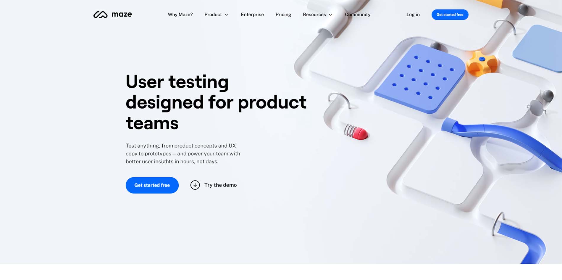
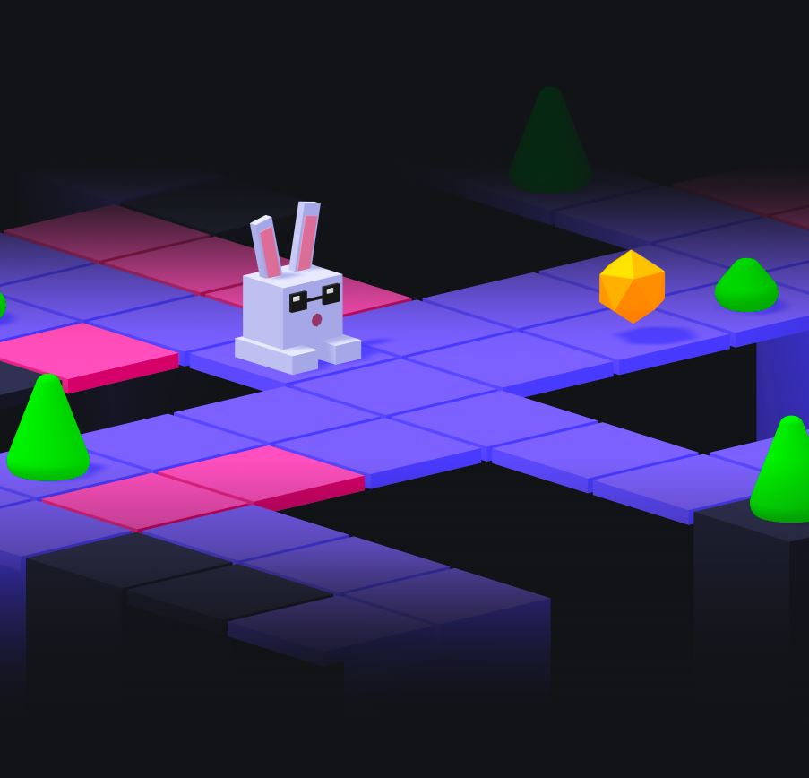
How suitable we should start with a UI testing company. It’s honestly just the first tab I pulled together on my browser but it really is a great place to start. Maze deftly pulls together 3D elements throughout their website to help further visitors understanding of their different products and services. The ball runs and various obstacles help aid understanding and offer a memorable visual experience… enough so that they end up featured in blog posts like this.
Jetty
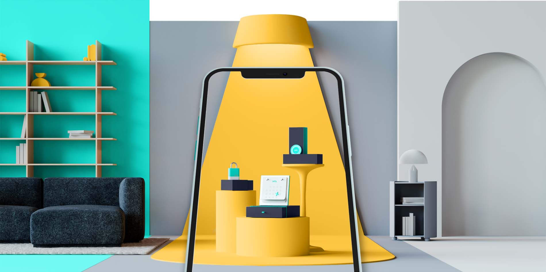
Jetty uses stylised renders of rooms, offices and rentals to help bring its brand to life while being accessible to everyone. By avoiding real imagery they keep their service location-agnostic, broadening their potential audience. The colourful furniture and decors featured also pull together the brand’s colours and UI elements to create a cohesive experience for visitors.
Cad Modelling Fit

https://cadmodellingfit.com/
Mannequins, not something that necessarily jumped to my mind when I set out to write this article but whilst trawling the web for inspiration this stood out. Maybe its the fact that the video reminded me somewhat of the opening title sequence to Westworld. The subtle use of a hero background video to highlight their hero products form and materials is brilliant. The use of lighting adds real depth and mystery and even helps tie together UI elements - especially the green key light and green buttons used on the homepage. Throughout the site they’ve made great use of CGI product renders as well. Just a brilliant example of how CGI can add real value and depth to a user experience - no matter the industry.
Immigr8
https://immigr8.net/
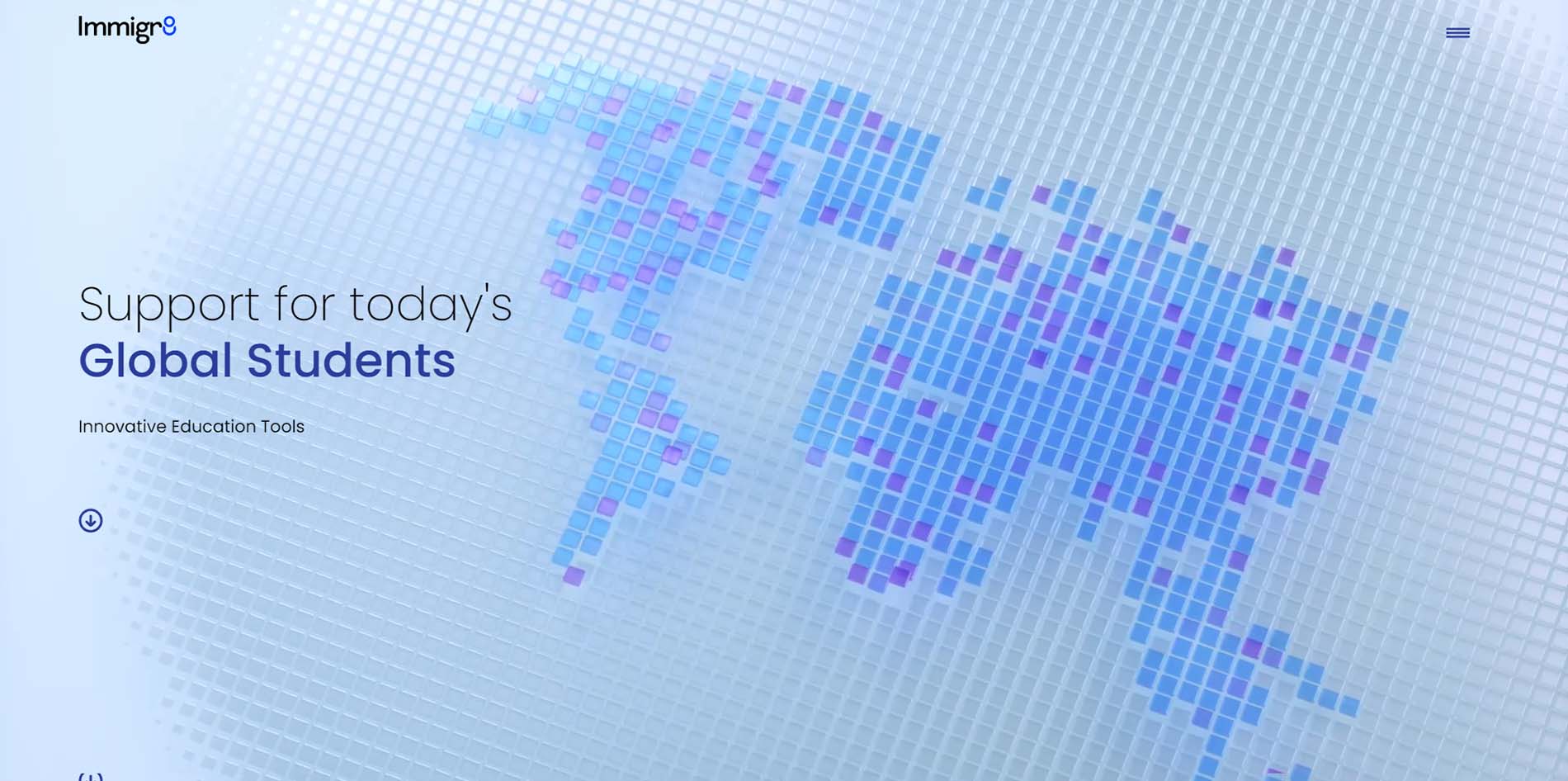
Immigr8 is the perfect example of designers using abstract elements and arrangements to add meaning to the content it’s positioned alongside. Further down the page is a list of features and service Immigr8 offer. To accompany each they’ve used the 3D tiles from their homepage and arranged them into fun and descriptive scenes that transcend language barriers, an important feature for sites with a global audience like immigr8.
Zoox

https://www.zoox.com/
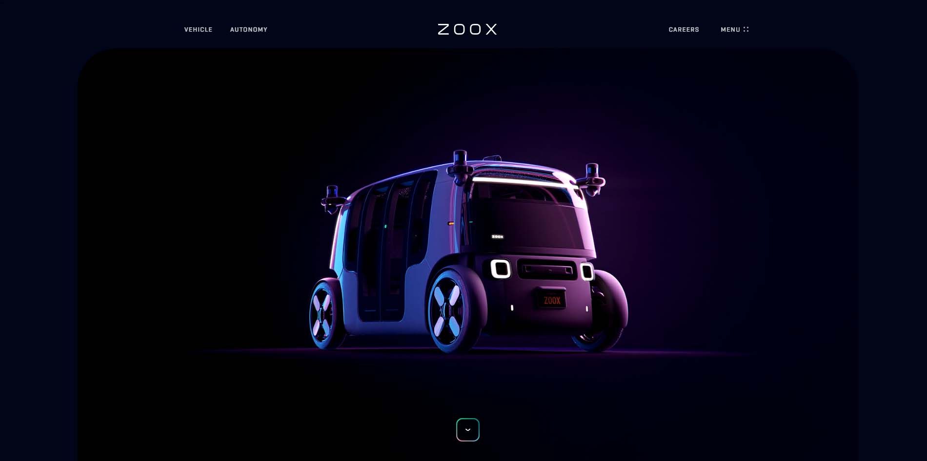
Zoox uses a beautiful CGI animation as an opening to their website. It creates a bold, on-brand introduction to their product and effortlessly takes users on a complete journey through Zoox’s main features and benefits as we scroll down the page. A clever on-scroll animation through the sunroof is also a brilliant piece of added interaction. As a side note - the colour and contrast on this website is brilliantly carried throughout the UI and CGI elements, creating a very vivid impression of the site.
The XRS

The XRS use CGI in a far more interactive fashion than any of the other sites featured here. At the cost of photo-realism, in-browser rendering is becoming a lot more powerful and certain materials and products can look very good in these scenarios. The XRS uses CGI and UI elements to highlight the products various features as we step through the site. At the bottom of the site, there is an excellent scrolling panel feature that showcases the different colour options.
EmptyState
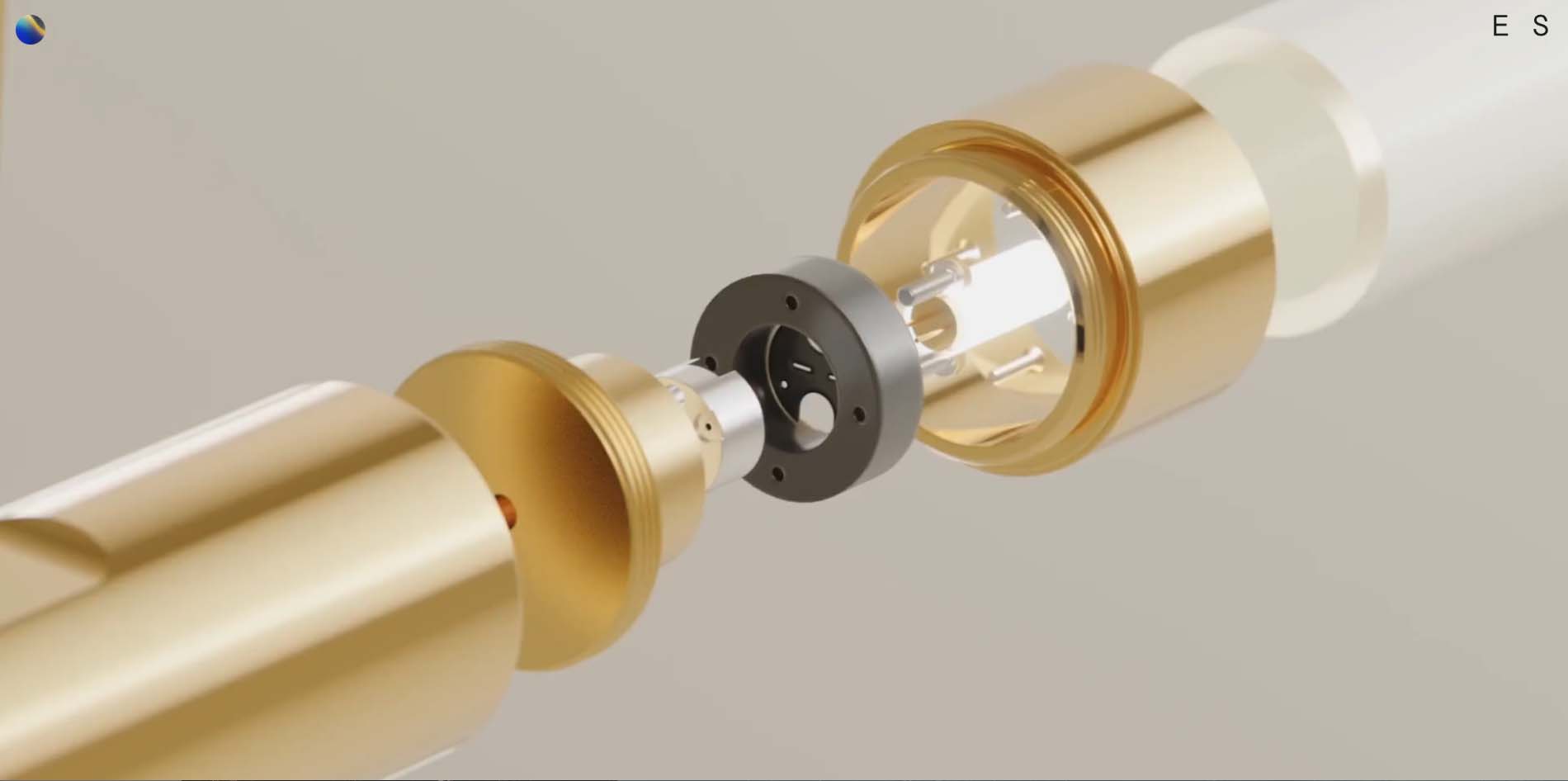
https://emptystate.com/product/sabre/
EmptyState creates iconic, handmade lighting products. I’ll be honest, some of the imagery is so beautiful I’m not entirely sure if it’s photography or CGI. But certainly, each product page uses CGI to demonstrate how the piece is constructed through an on-scroll animation. These animations add clarity to the products function and combine effortlessly with the imagery around the website.
Algoan
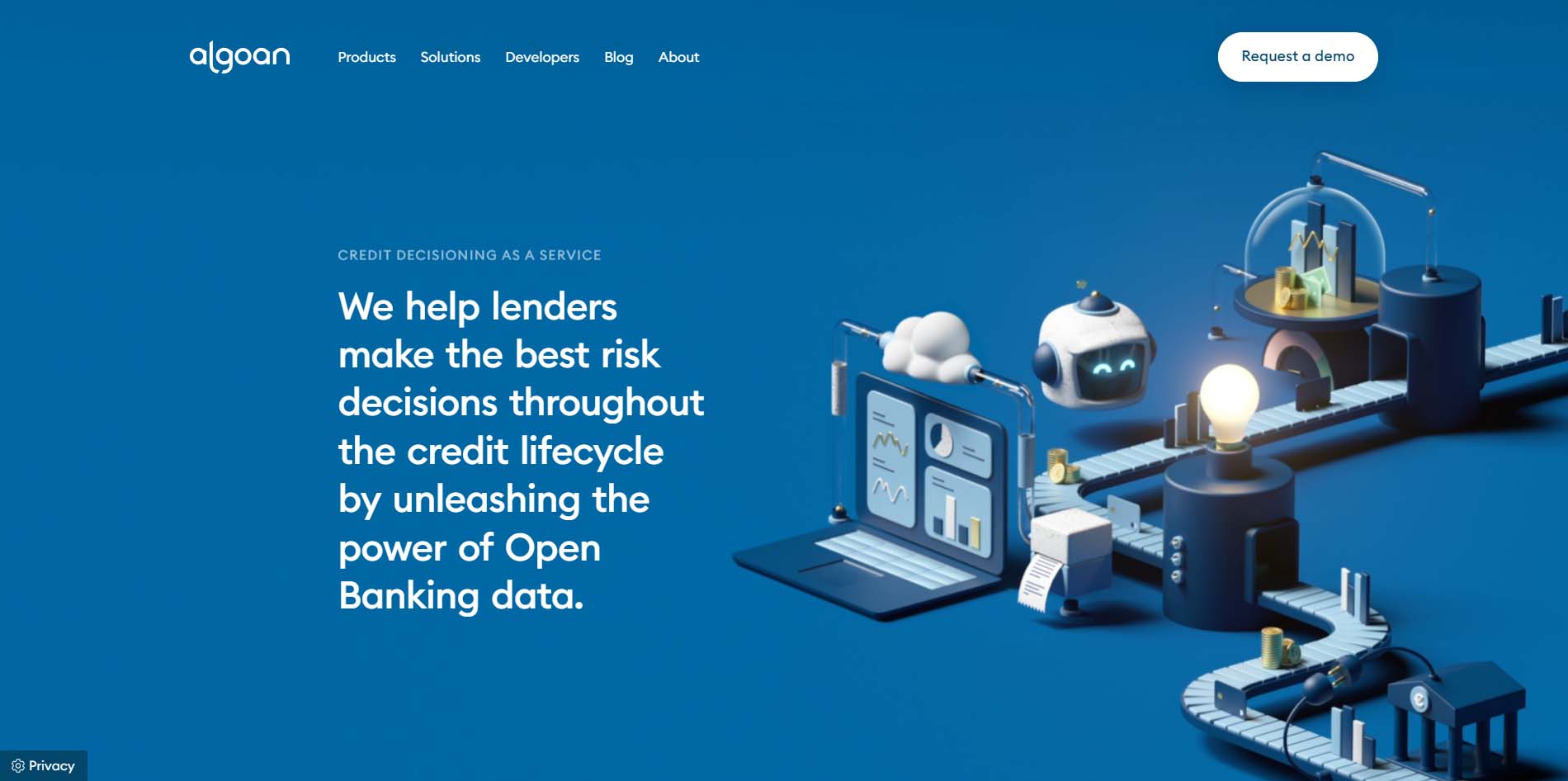
Algoan use 3D graphics to create abstract imagery that helps highlight their key services and drive visitors deeper into their website. Credit checking isn’t a service that lends itself to a particular visual identity and so is the perfect candidate for CGI and the creativity it allows. Conveyor belts with items representing different scoring metrics making their way through machines with lightbulbs overseen by floating cartoon robot heads (because that’s how credit checking works). The CGI here elevates the brand, creates a clearer more interesting user experience and looks great.
Ventus
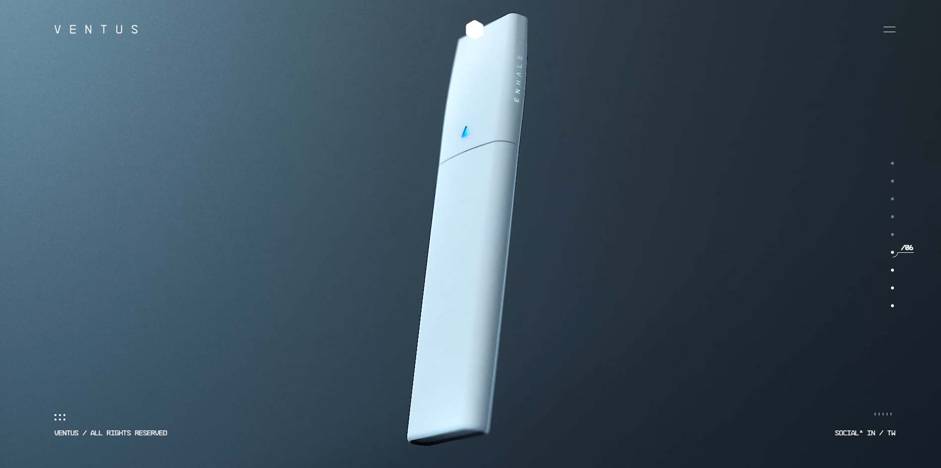
When researching this article this site stood out to me imparticular. Ventus use their homepage to guide visitors cohesively and effectively through their product story. We start with a mission statement and as we scroll we’re told about the company, the history and what drives the business. Calming music and imagery combined with the digital elements around the perimeter certainly piqued my interest and on my first visit, I wasn’t even sure what the product was at this stage. Not until several steps down the screen and after a carefully crafted story are we brilliantly shown the CGI product video as a full-screen experience. The contrast in visuals, and audio made for a truly unique website experience. Head over there and see for yourself. Perfect.
3D Graphics in Websites and UI
So there we have it, 9 websites that use 3D graphics to create user experiences that grab attention and ultimately drive action. Whether it's simply adding a more immersive experience to demonstrating a products features and value or creating abstract and creative ways of communicating complex services - CGI gives marketing teams and business owners the opportunity to capture and convert their visitors more effectively than traditional photos - or *gulp* - stock photography.

Shopify CRO checklist
Inside, you’ll find:
- 320+ action items covering every stage of the customer journey.
- Practical, ready-to-use tasks you can tick off one by one.
- Insights to improve speed, trust, cart recovery, mobile UX, and more.


.svg)

